This section describes the Sequence Chart in detail, focusing on its features without a particular example.
The Sequence Chart is divided into three parts: the top gutter, the bottom gutter and the main area. The gutters show the simulation time while the main area displays module axes, events and message sends. The chart grows horizontally with simulation time and vertically with the number of modules. Module axes can optionally display enumerated or numerical vector data.
There are various options, which control how and what the Sequence Chart displays. Some of these are available on the toolbar, while others are accessible only from the context menu.
Graphical elements on the Sequence Chart represent modules, events and messages, as listed in the following table.
 | simple module axis |
 | compound module axis |
 | axis with attached vector data |
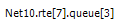 | module full path as axis label |
 (hollow circle)
 | initialization event |
 (green disc)
 | self-message processing event |
 (red disc)
 | message processing event |
 | event number |
 (blue arrow, arched)
 | self-message |
 (blue arrow)
 | message send |
 (green dotted arrow)
 | message reuse |
 (brown dotted arrow)
 | method call |
(arrow with a dashed segment) | message send that goes far away; split arrow |

(arrow with zigzag) | virtual message send; zigzag arrow |
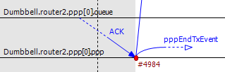
(blue parallelogram) | transmission duration; reception at start |
(blue parallelogram) | transmission duration; reception at end |
(blue strips) | split transmission duration; reception at start |
(blue strips) | split transmission duration; reception at end |
 (blue letters)
 | message name |
 (brown letters)
 | method name |
 (gray background)
 | zero simulation time region |
 (dashed gray line)
 | simulation time hairline |
Simulation time may be mapped onto the horizontal axis in various ways; linear mapping is only one of the ways. The reason for having multiple mapping modes is that intervals between interesting events are often of different magnitudes (e.g. microsecond timings in a MAC protocol versus multi-second timeouts in higher layers), which is impossible to visualize using a linear scale.
The available timeline modes are:
- Linear -- the simulation time is proportional to the distance measured in pixels.
- Event number -- the event number is proportional to the distance measured in pixels.
- Step -- the distance between subsequent events, even if they have non-subsequent event numbers, is the same.
- Nonlinear -- the distance between subsequent events is a nonlinear function of the simulation time between them. This makes the figure compact even if there are several magnitudes difference between simulation time intervals. On the other hand, it is still possible to decide which interval is longer and which one is shorter.
- Custom nonlinear -- like nonlinear. This is useful in those rare cases when the automatic nonlinear mode does not work well. The best practice is to switch to Nonlinear mode first and then to Custom nonlinear, so that the chart will continuously refresh as the parameters change. At the extreme, you can set the parameters so that the nonlinear mode becomes equivalent to linear mode or step mode.
You can switch between timeline modes using the ![]() button on the toolbar or from the context menu.
button on the toolbar or from the context menu.
It is quite common in simulation models for multiple events to occur at the same simulation time, possibly in different modules. A region with a gray background indicates that the simulation time does not change along the horizontal axis within the area, thus all events inside it have the same simulation time associated with them.
The Sequence Chart's vertical axis corresponds to modules in the simulation. By default, each simple module is displayed on a separate horizontal axis and events that occurred in that module are shown as circles on it. A compound module is represented with a double line and it will display events from all contained simple modules, except internal events and those that have their own axes displayed. An event is internal to a compound module if it only processes a message from, and sends out messages to, other modules inside.
It is not uncommon for some axes to not have any events at all. These axes would waste space by occupying some place on the screen, so by default they are omitted from the chart unless the Show Axes Without Events option is turned on. The discovery process is done lazily as you navigate through the chart, and it may add new axes dynamically as soon as it turns out that they actually have events.
Module axes can be reordered with the option Axis Ordering
Mode ![]() . Ordering can be manual, or sorted
by module name, by module id or by minimizing the total number of axes that arrows
cross.
. Ordering can be manual, or sorted
by module name, by module id or by minimizing the total number of axes that arrows
cross.
Note
The algorithm that minimizes crossings works by taking a random sample from the file and determines the order of axes from that (which means that the resulting order will only be an approximation). A more precise algorithm, which takes all arrows into account would not be practical because of the typically large size of eventlog files.The upper and lower edges of the Sequence Chart show a gutter that displays the simulation time. The left side of the top gutter displays a time prefix value, which should be added to each individual simulation time shown at the vertical hairlines. This reduces the number of characters on the gutter and allows easier recognition of simulation time changes in the significant digits. The right side of the figure displays the simulation time range that is currently visible within the window.
Tip
To see the simulation time at a specific point on the chart, move the mouse to the desired place and read the value in the blue box horizontally aligned with the mouse on the gutter.
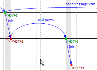
Events are displayed as filled circles along the module axes. A green circle represents the processing of a self-message, while a red circle is an event caused by receiving a message from another module. The event with event number zero represents the module initialization phase and may spread across multiple module axes because the simulation kernel calls each module during initialization. This event is displayed with a white background.
Event numbers are displayed below and to the right of their corresponding events and are prefixed with '#'. Their color changes according to their events' colors.
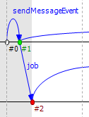
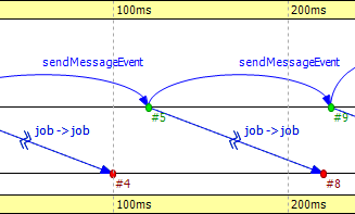
The Sequence Chart represents message sends with blue arrows. Vertically, the arrow starts at the module which sent the message and ends at the module which processed the message. Horizontally, the start and end points of the arrow correspond to the sender and receiver events. The message name is displayed near the middle of the arrow, but not exactly in the middle to avoid overlapping with other names between the same modules.
Sometimes, when a message arrives at a module, it simply stores it and later sends
the very same message out. The events, where the message arrived, and where the
message was actually sent, are in a so-called "message reuse" relationship. This is
represented by a green dotted arrow between the two events. These arrows are not
shown by default because timer self-messages are usually reused
continuously. This would add unnecessary clutter to the chart and would make it
hard to understand. To show and hide these arrows, use the Show Reuse
Messages ![]() button on the toolbar.
button on the toolbar.
Sometimes, depending on the zoom factor, a message send goes far away on the chart. In this case, the line is split into two smaller parts that are displayed at the two ends pointing towards each other, but without a continuous line connecting them. At one end of both arrow pieces is a dotted line while at the other end is a solid line. The one which is solid always points exactly to, or from, the event to which it is connected. The other one, which is dotted, either specifies the module where the arrow starts, or ends, or in the case of a self-message, it points toward the other arrow horizontally.
It is possible to display a module's state on an axis. The axis is then rendered as a colored strip that changes color every time the module state changes. The data are taken from an output vector in an output vector file, normally recorded by the simulation together with the eventlog file.
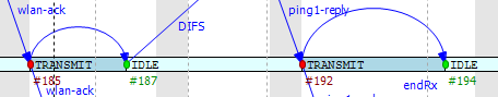
To attach an output vector to an axis, right-click the desired axis and select Attach Vector to Axis from the context menu. You will be prompted for an output vector file and for a vector in the file. If the vector is of type enum (that is, it has metadata attached that assigns symbolic names to values, e.g. IDLE for 0, TRANSMIT for 1, etc.), then the chart will display symbolic names inside the strip, otherwise it will display the values as numbers. The background coloring for the strip is automatic.
Note
Recording output vectors is explained in the OMNeT++ Simulation Manual.
It is recommended to turn on recording event numbers
(**.vector-record-eventnumbers = true inifile setting), because that
allows the Sequence Chart tool to display state changes accurately even
if there are multiple events at the same simulation time.
The format of output vector files is documented in an appendix of the Manual.
To see whether a given output vector is suitable for the Sequence Chart,
search for the vector declaration (vector... line) in the file.
When event numbers are enabled, the vector declaration will end in ETV
(not TV). If a vector has an enum attached, there will be an attr enum
line after the vector declaration. An example vector declaration with an enum:
vector 5 Net.host[2].radio state ETV
attr enum "IDLE=0,TRANSMIT=1,RECEIVE=2"
To zoom in or out horizontally along the timeline, use the Zoom
In ![]() and Zoom Out
and Zoom Out ![]() buttons on the toolbar. To decrease or increase the
distance between the axes, use the Increase/Decrease Spacing
buttons on the toolbar. To decrease or increase the
distance between the axes, use the Increase/Decrease Spacing
![]()
![]() commands.
commands.
Warning
When you zoom out, more events and messages become visible on the chart, making it slower. When you zoom in, message lines start break, making it less informative. Try to keep a reasonable zoom level.
To scroll through the Sequence Chart, use either the scroll bars, drag with the left mouse button or scroll with the mouse wheel using the Shift modifier key for horizontal scroll.
There are also navigation options to go to the previous (Shift+LEFT) or next (Shift+RIGHT) event in the same module.
Similar to navigating in the Eventlog Table, to go to the cause event, press Ctrl+LEFT. To go to the arrival of a message send, press Ctrl+RIGHT while an event is selected.
The Sequence Chart displays tooltips for axes, events, message sends and reuses. When a tooltip is shown for any of the above, the chart will highlight the corresponding parts. Sometimes, when the chart is zoomed out it might show a complex tooltip immediately because there are multiple items under the mouse.
Tip
To measure the simulation time difference between two events, select one of them while staying at the other to display the tooltip.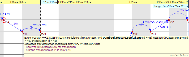
Just like the Eventlog Table, the Sequence Chart also supports bookmarks to make navigation easier. Bookmarks are saved for the files rather than the various editors, therefore they are shared between them. The chart highlights bookmarked events with a circle around them similar to primary selection but with a different color.
When you open an eventlog file in the Sequence Chart editor, it will automatically open the Eventlog Table View with the same file. If you select an event on the Sequence Chart editor, then the Eventlog Table View will jump to the same event and vice versa. This interconnection makes navigation easier and you can immediately see the details of the selected event's raw data.
You can also filter the contents of the Sequence Chart. This actually means that some of the events are not displayed on the chart so that the user can focus on the relevant parts. When filtering is turned on (displayed in the status line), some of the message arrows might have a filter sign (a double zigzag crossing the arrow line's center). Such a message arrow means that there is a message going out from the source module, which after processing in some other filtered out modules, reaches the target module. The message name of the arrow in this case corresponds to the first and the last message in the chain that was filtered out.
When a module filter is used, it will determine which modules will have axes. If the events that occurred in a module are completely filtered out, then the Sequence Chart will not display the superfluous axis belonging to that module. This reduces the number of axes and makes it easier to understand the figure.
Events may not have subsequent event numbers, which means that the events in between have been filtered out. At the extreme, the chart may even be empty, meaning that there are no matching events at all.
To filter the Sequence Chart, open the Filter Dialog using the
filter button ![]() on the toolbar. You can also filter from
the context menu using the shortcuts provided for events and message sends
currently under the mouse.
on the toolbar. You can also filter from
the context menu using the shortcuts provided for events and message sends
currently under the mouse.