The Analysis Editor is implemented as a multi-page editor. What the editor edits is the "recipe": what result files to take as inputs, what data to select from them, what (optional) processing steps to apply, and what kind of charts to create from them. The pages (tabs) of the editor roughly correspond to these steps.
The first page displays the result files that serve as input for the analysis. The upper half specifies what files to select using explicit filenames or wildcards. New input files can be added to the analysis by dragging vector and scalar files from the Project Explorer View, or by opening dialogs with the Add File... or Wildcard... buttons. If the file name starts with '/,' it is interpreted relative to the workspace root; otherwise, it is relative to the folder of the analysis file.
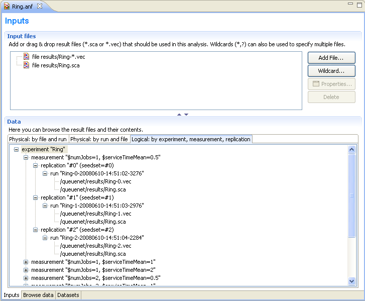
The input files are loaded when the analysis file is opened. When the file changes on the disk, it is reloaded automatically when the workspace is refreshed (Eclipse refreshes the workspace automatically if the General|Workspace|Refresh automatically option is turned on in the Preferences). Vector files are not loaded directly; instead, an index file is created and the vector attributes (name, module, run, statistics, etc.) are loaded from the index file. The index files are generated during the simulation, but can be safely deleted without loss of information. If the index file is missing or the vector file was modified, the IDE rebuilds the index in the background.
Tip
The Progress View displays the progress of the indexing process.
The lower half shows what files matched the input specification and what runs they contain. Note that OMNeT++ 4.x result files contain a unique run ID and several metadata annotations in addition to the actual recorded data. The third tree organizes simulation runs according to their experiment-measurement-replication labels.
The underlying assumption is that users will organize their simulation-based research into various experiments. An experiment will consist of several measurements, which are typically (but not necessarily) simulations done with the same model but with different parameter settings (i.e. the user will explore the parameter space with several simulation runs). To gain statistical confidence in the results, each measurement may be repeated several times with different random number seeds. It is easy to set up such scenarios with the improved INI files of OMNeT++ 4.x. Then, the experiment-measurement-replication labels will be assigned automatically (Note: please refer to the chapter "Configuring and Running Simulations" in the manual for more discussion).
The second page of the Analysis editor displays results (vectors, scalars and histograms) from all files in tables and lets the user browse them. Results can be sorted and filtered. Simple filtering is possible with combo boxes, or when that is not enough, the user can write arbitrarily complex filters using a generic pattern-matching expression language. Selected or filtered data can be immediately plotted, or remembered in named datasets for further processing.
Tip
You can switch between the All, Vectors, Scalars and Histograms pages using the underlined keys (Alt+KEY combination) or the Ctrl+PgUp and Ctrl+PgDown keys.Pressing the Advanced button switches to advanced filter mode. In the text field, you can enter a complex filter pattern.
Tip
You can easily display the data of a selected file, run, experiment, measurement or replication if you double-click on the required tree node in the lower part of the Inputs page. It sets the appropriate filter and shows the data on the Browse Data page.
If you right-click on a table cell and select the Set filter: ... action from the menu, you can set the value of that cell as the filter expression.
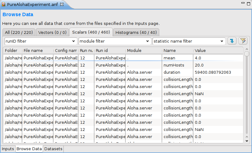
To hide or show table columns, open Choose table columns... from the context menu and select the columns to be displayed. The settings are persistent and applied in each subsequently opened editor. The table rows can be sorted by clicking on the column name.
You can display the selected data items on a chart. To open the chart, choose Plot from the context menu (double-click also works for single data lines). The opened chart is not added automatically to the analysis file, so you can explore the data by opening the chart this way and closing the chart page without making the editor "dirty."
The selected vector's data can also be displayed in a table. Make sure that the Output Vector View is opened. If it is not open, you can open it from the context menu (Show Output Vector View). If you select a vector in the editor, the view will display its content.
You can create a dataset from the selected result items. Select Add Filter Expression to Dataset... if you want to add all items displayed in the table. Select Add Filter Selected Data to Dataset... if you want to add the selected items only. You can add the items to an existing dataset, or you can create a new dataset in the opening dialog.
Tip
You can switch between the Inputs, Browse Data and Dataset pages using the Alt+PgUp and Alt+PgDown keys.A filter expression is composed of atomic patterns with the AND, OR, NOT operators. An atomic pattern filters for the value of a field of the result item and has the form <field_name>(<pattern>). The following table shows the valid field names. You can omit the name field and simply use the name pattern as a filter expression. It must be quoted if it contains whitespace or parentheses.
| Field | Description |
|---|---|
| name | the name of the scalar, vector or histogram |
| module | the name of the module |
| file | the file of the result item |
| run | the run identifier |
| attr: name | the value of the run attribute named name, e.g. attr:experiment |
| param: name | the value of the module parameter named name |
In the pattern specifying the field value, you can use the following shortcuts:
| Pattern | Description |
|---|---|
| ? | matches any character except '.' |
| * | matches zero or more characters except '.' |
| ** | matches zero or more characters (any character) |
| {a-z} | matches a character in range a-z |
| {^a-z} | matches a character not in range a-z |
| {32..255} | any number (i.e. sequence of digits) in range 32..255 (e.g. "99") |
| [32..255] | any number in square brackets in range 32..255 (e.g. "[99]") |
| \ | takes away the special meaning of the subsequent character |
Tip
Content Assist is available in the text fields where you can enter a filter expression. Press Ctrl+Space to get a list of appropriate suggestions related to the expression at the cursor position.
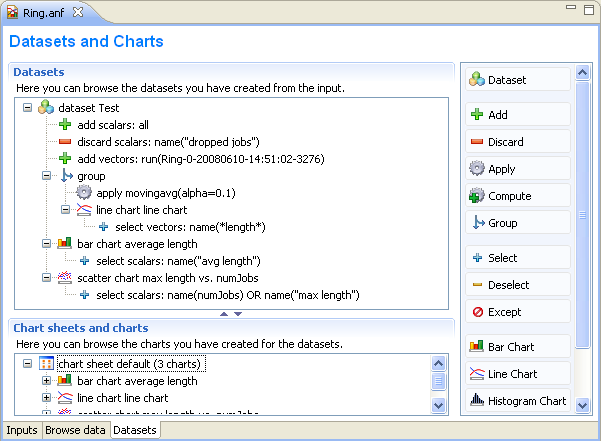
The third page displays the datasets and charts created during the analysis. Datasets describe a set of input data, the processing applied to them and the charts. The dataset is displayed as a tree of processing steps and charts. There are nodes for adding and discarding data, applying processing to vectors and scalars, selecting the operands of the operations and content of charts, and for creating charts.
Tip
You can browse the dataset's content in the Dataset View. Open the view by selecting Show Dataset View from the context menu. Select a chart to display its content or another node to display the content of the dataset after processing is applied.
The usual tree editing operations work on the Dataset tree. New elements can be added by dragging elements from the palette on the right to an appropriate place on the tree. Alternatively, you can select the parent node and press the button on the toolbar. An existing element can be edited by selecting the element and editing its properties on the property sheet, or by opening an item-specific edit dialog by choosing Properties... from the context menu.
Tip
Datasets can be opened on a separate page by double-clicking on them. It is easier to edit the tree on this page. Double-clicking a chart node will display the chart.
Computations can be applied to the data by adding Apply to Vectors/Compute Vectors/Compute Scalars nodes to the dataset. The input of the computations can be selected by adding Select/Deselect children to the processing node. By default, the computation input is the whole content of the dataset at the processing node. Details of the computations are described in the next sections.
Processing steps within a Group node only affect the group. This way, you can create branches in the dataset. To group a range of sibling nodes, select them and choose Group from the context menu. To remove the grouping, select the Group node and choose Ungroup.
Charts can be inserted to display data. The data items to be displayed can be selected by adding Select/Deselect children to the chart node. By default, the chart displays all data in the dataset at its position. You can modify the content of the chart by adding Select and Deselect children to it. Charts can be fully customized including setting titles, colors, adding legends, grid lines, etc. See the Charts section for details.
Both Compute Vectors and Apply to Vectors nodes compute new vectors from other vectors. The difference between them is that Apply to Vectors will remove its input from the dataset, while Compute keeps the original data, too.
Table 10.1, “Processing operations” contains the list of available operations on vectors.
Table 10.1. Processing operations
| Name | Description |
|---|---|
| scatter | Create scatter plot dataset. The first two arguments identifies the scalar selected for the X axis. Additional arguments identify the iso attributes; they are (module, scalar) pairs, or names of run attributes. |
| add | Adds a constant to the input: youtk = yk + c |
| compare | Compares value against a threshold, and optionally replaces it with a constant |
| crop | Discards values outside the [t1, t2] interval |
| difference | Substracts the previous value from every value: youtk = yk - yk-1 |
| diffquot | Calculates the difference quotient of every value and the subsequent one: youtk = (yk+1-yk) / (tk+1-tk) |
| divide-by | Divides input by a constant: youtk = yk / a |
| divtime | Divides input by the current time: youtk = yk / tk |
| expression | Evaluates an arbitrary expression. Use t for time, y for value, and tprev, yprev for the previous values. |
| integrate | Integrates the input as a step function (sample-hold or backward-sample-hold) or with linear interpolation |
| lineartrend | Adds linear component to input series: youtk = yk + a * tk |
| mean | Calculates mean on (0,t) |
| modulo | Computes input modulo a constant: youtk = yk % a |
| movingavg | Applies the exponentially weighted moving average filter: youtk = youtk-1 + alpha*(yk-youtk-1) |
| multiply-by | Multiplies input by a constant: youtk = a * yk |
| nop | Does nothing |
| removerepeats | Removes repeated y values |
| slidingwinavg | Replaces every value with the mean of values in the window: youtk = SUM(yi,i=k-winsize+1..k)/winsize |
| subtractfirstval | Subtract the first value from every subsequent values: youtk = yk - y[0] |
| sum | Sums up values: youtk = SUM(yi, i=0..k) |
| timeavg | Calculates the time average of the input (integral divided by time) |
| timediff | Returns the difference in time between this and the previous value: youtk = tk - tk-1 |
| timeshift | Shifts the input series in time by a constant: toutk = tk + dt |
| timetoserial | Replaces time values with their index: toutk = k |
| timewinavg | Calculates time average: replaces input values in every `windowSize' interval with their mean. toutk = k * winSize youtk = average of y values in the [(k-1)*winSize, k*winSize) interval |
| winavg | Calculates batched average: replaces every `winsize' input values with their mean. Time is the time of the first value in the batch. |
The Compute Scalars dataset node adds new scalars to the dataset whose values are computed from other statistics in the dataset. The input of the computation can be restricted by adding Select/Deselect nodes under it.
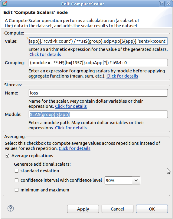
In the Properties dialog of the Compute Scalars node, you can set the name and module of the generated scalars, and the expression that computes their values. You can also can enter a grouping expression, and set flags to average the values across replications. Content Assist (Ctrl+SPACE) is available for the Value field, it can propose statistic and function names.
The content of the dialog is validated after each keystroke, and errors are displayed as small icons next to the edit field. Hovering over the error icon shows the error message. However, not all errors can be detected statically, in the dialog. If an error occurs while performing the computation, then an error marker is added to the analysis file and to the corresponding dataset node in the Analysis editor. You can view the error in the Problems View, and double-clicking the problem item navigates back to the Compute Scalars node.
When a Compute Scalars node in the dataset is evaluated, computations will use the fields rougly in the order they appear in the dialog. First, grouping takes place (by simulation run, and then by the optional grouping expression); then values are computed; then values are stored by the given name and module; and finally, averaging across simulation runs takes place.
Explanation the dialog fields:
Value. This is an arithmetic expression for the value of the generated scalar(s). You can use the values of existing scalars, various properties of existing vectors and histograms (mean, min, max, etc), normal and aggregate functions (mean, min, max, etc), and the usual set of operators.
To refer to the value of a scalar, simply use the scalar name (e.g. pkLoss),
or enclose it with apostrophes if the name of the scalar contains special characters
(e.g. 'rcvdPk:count'.) If there are several scalars with that name in the
input dataset, usually recorded by different modules or in different runs, then the computation
will be performed on each. The scalar name cannot contain wildcards or dollar variables (see later.)
When necessary, you can qualify the scalar name with a module name pattern that will be
matched against the full paths of modules. The same pattern syntax is used as in ini files and
in other parts of the Analysis Tool (Quick reminder: use * and ** for wildcards, {5..10}
for numeric range, [5..10] for module index range). If multiple scalars match
the qualified name, the expression will be computed for each. If there are several such patterns
in the expression, then the computation will be performed on their Cartesian product.
If the expression mentions several unqualified scalars (i.e. without module pattern),
they are expected to come from the same module. For example, if your expression is foo+bar
but the foo and bar scalars have been recorded by different modules, the result will be empty.
The iteration can be restricted by binding some part of the module name to variables,
and use those variables in other patterns. The ${x=<pattern>} syntax in a module
name pattern binds the part of the module name matched to pattern to a variable named x.
These variables can be referred as ${x} in other patterns. The ${...} syntax also allows
you to embed expressions (e.g. ${x+1}) into the pattern.
To make use of vectors and histograms in the computation, you can use the count(),
mean(), min(), max(), stddev() and variance() functions to access their properties
(e.g. count(**.mac.pkDrop) or max('end-to-end delay')).
The following functions can be applied to scalars or to an expression that yields a scalar value:
count(), mean(), min(), max(), stddev(), variance().
These aggregate functions produce one value for a group of scalars instead of one for each scalar.
By default, each scalar belongs to the same group, but it is possible to group them by module name (see Grouping).
Aggregate functions cannot cross simulation run boundaries, e.g they cannot be used to compute average over
all replications of the same configuration; use the Average replications checkbox for that.
Grouping.
Scalars can be grouped by module or value before the value computation, and you can enter a grouping
expression here. Grouping is the most useful when you want to use aggregate functions
(count(), mean(), etc.) in the value expression.
The grouping expression is evaluated for each statistic in the input dataset, and the resulting value
denotes the statistic's group. For example, if the expression produces 0 for some statistics
and 1 for others, there will be two groups. Aggregate functions (count(), mean(), etc.)
are performed on each group independently.
In the grouping expression, you can refer to the name, module and values of the statistic
(module, name and value; the latter is only meaningful on scalars, and produces NaN
for histograms and vectors), and to attributes of the simulation run (run, configname,
runnumber, experiment, measurement, replication, iteration variables of the ini file, etc.)
However, note that run attributes are not as useful as they would appear, because grouping
only takes place within simulation runs, you cannot join data from several simulation runs
into one group this way.
Often you want derive the group identifier from some part of the module name.
A useful tool for that is the pattern matching operator (=~) combined with conditionals (? :).
The expression <str> =~ <pat> matches the string str with the pattern pat.
If there is no match, the value of the expression is false, otherwise the input string str
(which counts as true). The useful bit is that you can bind parts of the matching string to variables
with the ${x=<pattern>} syntax in the pattern (see above), and you can use those variables
later in the grouping expression, and also in the Value, Name and Module fields.
Name.
This is the name for the generated scalars. You can enter a literal string here.
You can also use dollar variables bound in the Value and Grouping fields (e.g. ${x}),
and their expressions (e.g. ${x+y+1}).
Module.
This is the place where you can enter the module name for the newly computed scalars.
If the value expression contains unqualified scalars (those without module name patterns)
that are not subject to aggregate functions, and you agree to place
the new scalars into the same modules as theirs, then this field can be left empty.
Otherwise, enter the module name. You can use dollar variables bound in the Value and
Grouping fields (e.g. ${x}), and their expressions (e.g. ${x+y+1}).
Note that the module name does not need to be an existing module name; you can "make up"
new modules by entering arbitrary names here.
Average replications checkbox. Check to compute only the avarage value across repetitions.
The computation is performed in each run independently by default. If some run is a replication of the same measurement with different seeds, you may want to average the results. If the Average replications checkbox is selected, then only one scalar is added to the dataset for each measurement.
A new run generated for the scalar which represents the set of replications which it is computed from. The attributes of this run are those that have the same value in all replications.
Other checkboxes.
In addition to mean, you can also add other statistical properties of the computed scalar to the dataset
by selecting the corresponding checkboxes in the dialog. The names of these new scalars
will be formed by adding the :stddev, :confint, :min, or :max suffix
to the base name of the scalar.
Note
A more formal description of the Compute Scalars feature's operation, together with the list of available functions and other details, can be found in the Appendix (see Appendix A, Specification of the 'Compute Scalars' operation).Examples. Let us illustrate the usage of the computations with some examples.
Assume that you have several source modules in the network that generate CBR traffic, parameterized with packet length (in bytes) and send interval (seconds). Both parameters are saved as scalars by each module (
pkLen,sendInterval), but you want to use the bit rate for further computations or charts. Adding a Compute Scalar node with the following content will create an additionalbitratescalar for each source module:Value:
pkLen*8/sendIntervalName:
bitrate
Assume that several sink modules record
rcvdByteCountscalars, and the simulation duration is saved globally as thedurationscalar of the toplevel module. We are interested in the throughput at each sink module. In the value expression we can refer to thedurationscalar by its qualified name, i.e. prefix it with the full name of its module.rcvdByteCountcan be left unqualified, and then the Module field doesn't need to be filled out because it will be inferred from thercvdByteCountstatistic.Value:
8*rcvdByteCount / Network.durationName:
throughput
If you are interested in the total number of bytes received in the network, you can use the
sum()function. In this example we store the result as a new scalar of the toplevel module,Network.Value:
sum(rcvdByteCount)Name:
totalRcvdBytesModule:
Network
If several modules record scalars named
rcvdByteCountbut you are only interested in the ones recorded from network hosts, you can qualify the scalar name with a pattern:Value:
sum(**.host*.**.rcvdByteCount)Name:
totalHostRcvdBytesModule:
Network
Note
An alternative solution would be to restrict the input of the Compute Scalars node by adding a Select child under it.If several modules record vectors named
end-to-end delayand you are interested in the average of the peak end-to-end delays experienced by each module, you can use themax()function on the vectors to get the peak, thenmean()to obtain their averages. Note that the vector name needs to be quoted with apostrophes because it contains spaces.Value:
mean(max('end-to-end delay'))Name:
avgPeakDelayModule:
Network
Let's assume there are 3 clients (
cli0, cli1, cli2) and 3 servers (srv0, srv1, srv2) in the network, and each client sends datagrams to the corresponding server. The packet loss per client-server pair can be computed from the number of sent and received packets. We use theivariable to match the corresponding clients and servers. (Without theivariable, i.e. by writing justNet.cli*.pkSent - Net.srv*.pkRcvd, the result would be Cartesian product.)Value:
Net.cli${i={0..2}}.pkSent - Net.srv${i}.pkRcvdName:
pkLossModule:
Net.srv${i}
A similar example is when you want to compute the total number of transport packets (the sum of the TCP and UDP packet counts) for each host. Since the input scalars are recorded by different modules, we need the
hostvariable to match TCP and UDP modules under the same host.Value:
${host=**}.udp.pkCount + ${host}.tcp.pkCountName:
transportPkCountModule:
${host}
This example is a slight modification of the previous example. Assume that the TCP module writes an output vector (named
pkSent) containing the length of each packet sent, and the UDP module writes a histogram of the sent packet lengths. As in the previous example, we want to compute the number of sent packets for each host; we usecount()to extract the number of values from histograms and output vectors.Value:
count(${host=**}.udp.pkSent) + count(${host}.tcp.pkSent)Name:
pkCountModule:
${host}
Now we are computing the average number of data packets sent by the hosts. We will use the
mean()function in the Value expression:mean(${host=**}.udp.pkCount + ${host}.tcp.pkCount). Themeanfunction computes one value from a set of values. Because this value can not be associated with one host, thehostvariable will be undefined outside themean()function call. Therefore you can not enter${host}into the Module, but an appropriate module name should be choosen. Important: themean()function cannot be used to compute the average of values that come from different runs, as the Value expression is always evaluated with input statistics that come from the same run; you have to use the Average replications checkbox for that instead.Value:
mean(${host=**}.udp.pkCount + ${host}.tcp.pkCount))Name:
avgPkCountModule:
Network
Again, we are interested in the average number of sent packets, but we want to compute the average for each subnet. In SQL you would use the GROUP BY clause to generate that report, here you can use the Grouping expression. Let us assume that the subnets are at the second level of the module hierarhcy, so they can be identified by the second component of the full names of modules. Giving
(module =~ *.${subnet=*}.**) ? subnet : "n/a"as the Grouping expression, the group identifier will be the subnet of the modules (andn/afor the network). Now the same Value expression as in the previous example computes the average for each subnet. Thegroupvariable now contains the name of the subnet, so you can use the${group}expression as the Module.Value:
mean(${host=**}.udp.pkCount + ${host}.tcp.pkCount))Grouping:
(module =~ *.${subnet=*}.**) ? subnet : "n/a"Name:
avgPkCountModule:
${group}
It is also possible to group the scalars by their values.
Value:
count(responseTime)Grouping:
value > 1.0 ? "Large" : "Normal"Name:
num${group}ResponseTimesor:
${"num" ++ group ++ "ResponseTimes"}Module:
Network
Note
Note the use of++for string concatenation in the name expression. The normal+operator does numeric addition, and it would attempt to convert both operands to a numbers beforehand.Assume that you run the simulation with the same parameter settings, but different seeds, i.e. you have runs that are replications of the same measurement. Then computations are repeated for each run, therefore they produce values for each replications. If you are not interested in the individual results in the replications, you can generate only their average by turning on the Average replications checkbox. The average will be saved with the name entered into the Name field. The minimum/maximum value, the standard deviation of the distribution, and the confidence interval of the mean can also be generated. Their name will contain a
:min,:max,:stddev,:confintsuffix.To add a constant value as a scalar, enter the value into Value field, its name into the Name, and the module name into the Module field. Note that you can use any name for the target module, not just names of existing modules. As a result of the computation, one scalar will be added in every run that is present in the input dataset.
Value:
299792458Name:
speedOfLightModule:
Network.channelControl
If you want to add the constant for each module in your dataset, then enter
moduleinto the Grouping field, and${group}into the Module field. In this case the statistics of the input dataset are grouped not only by their run, but by their module name too. The expression entered into the Grouping field is a predefined variable, that refers to the module name of the statistic which the group identifier is generated for. We refer to the value of the group identifier (i.e. the module name) in the Module field.Value:
3.1415927Grouping:
moduleName:
piModule:
${group}
Sometimes multiple steps are needed to compute what you need. Assume you have a network where various modules record ping round-trip delays (RTT), and you want to count the modules with large RTT values (where the average RTT is more than twice the global average in the network). The following examples achieves that. Step 1 and 2 could be merged, but we left them separate for better readability.
Step 1:
Value:
mean('rtt:vector')Name:
average
Step 2:
Value:
average / mean(**.average)Name:
relativeAverage
Step 3:
Value:
count(relativeAverage)Grouping:
value > 2.0 ? "Above" : "Normal"Name:
num${group}Module:
Net
In this example, we have 100 routers (
Net.rte[0]..Net.rte[99]) that all record the number of dropped packets (dropsscalar), and we want to know how many routers dropped 0..99 packets, 100..199 packets, 200..299 packets, and so on. For this we group the scalars by their values, and count the scalars in each group.Value:
count(drops)Grouping:
floor(value / 100)Name:
values in the ${group}00- groupModule:
Net
Assume we have the same 100 routers with drop count scalars as in the previous example. We want to group the routers in batches of 10 by index, and compute the average drop count in each batch.
Value:
mean(drops)Grouping:
(module=~ *.rte[${index=*}]) ? floor(index/10) : "n/a"Name:
avgDropsInGroup${group}Module:
Net
This is a variation of the previous example: if the batches are not of equal size, we can use the
locate(x,a1,a2,a3,...an)function to group them.locate()returns the index of the first element of a1..an that is less or equal than x (or 0 if x < a1).Value:
mean(drops)Grouping:
(module=~ *.rte[${index=*}]) ? locate(index,5,15,35,85) : "n/a"Name:
avgDropsInGroup${group}Module:
Net
You can export the content of the dataset into text files. Three formats are supported: comma separated values (CSV), Octave text files and Matlab script. Right-click on the processing node or chart, and select the format from the Export to File submenu. The file will contain the data of the chart, or the dataset after the selected processing is applied. Enter the name of the file and press Finish.
Vectors are always written as two columns into the CSV files, but the shape of the scalars table can be changed by selecting the grouping attributes in the dialog. For example, assume we have two scalars (named s1 and s2) written by two modules (m1 and m2) in two runs (r1 and r2), resulting in a total of 8 scalar values. If none of the checkboxes is selected in the Scalars grouped by group, then the data is written as:
| r1 m1 s1 | r1 m1 s2 | r1 m2 s1 | r1 m2 s2 | r2 m1 s1 | r2 m1 s2 | r2 m2 s1 | r2 m2 s2 |
|---|---|---|---|---|---|---|---|
| 1 | 2 | 3 | 4 | 5 | 6 | 7 | 8 |
Grouping the scalars by module name and scalar name would have the following result:
| Module | Name | r1 | r2 |
|---|---|---|---|
| m1 | s1 | 1 | 5 |
| m1 | s2 | 2 | 6 |
| m2 | s1 | 3 | 7 |
| m2 | s2 | 4 | 8 |
The settings specific to the file format are:
CSV. You can select the separator, line ends and quoting character. The default setting corresponds to RFC4180. The precision of the numeric values can also be set. The CSV file contains an optional header followed by the vector's data or groups of scalars. If multiple vectors are exported, each vector is written into a separate file.
Octave. The data is exported as an Octave text file. This format can be loaded into the R statistical data analysis tool, as well. The tables are saved as structures containing an array for each column.
Matlab. The data is exported as a Matlab script file. It can be loaded into Matlab/Octave with the source() function.
Sometimes, it is useful to display several charts on one page. When you create a chart, it is automatically added to a default chart sheet. Chart sheets and the their charts are displayed on the lower pane of the Datasets page. To create a new chart sheet, use the Chart Sheet button on the palette. You can add charts to it either by using the opening dialog or by dragging charts. To move charts between chart sheets, use drag and drop or Cut/Paste. You can display the charts by double-clicking on the chart sheet node.
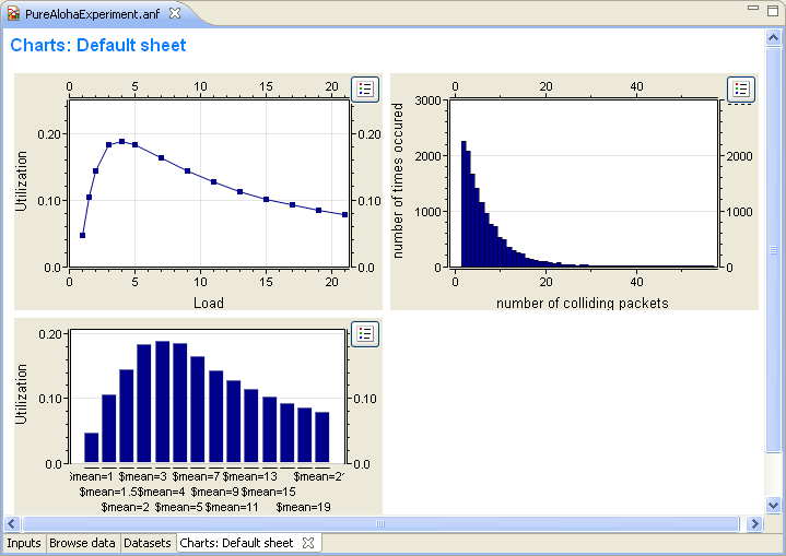
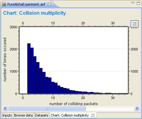
You typically want to display the recorded data in charts. In OMNeT++ 4.x, you can open charts for scalar, vector or histogram data with one click. Charts can be saved into the analysis file, too. The Analysis Editor supports bar charts, line charts, histogram charts and scatter charts. Charts are interactive; users can zoom, scroll, and access tooltips that give information about the data items.
Charts can be customized. Some of the customizable options include titles, fonts, legends, grid lines, colors, line styles, and symbols.
To create a chart, use the palette on the Dataset page. Drag the chart button and drop it to the dataset at the position you want it to appear. If you press the chart button then it opens a dialog where you can edit the properties of the new chart. In this case the new chart will be added at the end of the selected dataset or after the selected dataset item.
Temporary charts can be created on the Browse Data page for quick view. Select the scalars, vectors
or histograms and choose Plot from the context menu. If you want to save such a temporary chart
in the analysis, then choose Convert to dataset... from the context menu of the chart or
![]() from the toolbar.
from the toolbar.
You can open a dialog for editing charts from the context menu. The dialog is divided into several pages. The pages can be opened directly from the context menu. When you select a line and choose Lines... from the menu, you can edit the properties of the selected line.
You can also use the Properties View to edit the chart. It is recommended that users display the
properties grouped according to their category (![]() on the toolbar of the Properties View).
on the toolbar of the Properties View).
Table 10.2. Common chart properties
| Main | |
| antialias | Enables antialising. |
| caching | Enables caching. Caching makes scrolling faster, but sometimes the plot might not be correct. |
| background color | Background color of the chart. |
| Titles | |
| graph title | Main title of the chart. |
| graph title font | Font used to draw the title. |
| x axis title | Title of the horizontal axis. |
| y axis title | Title of the vertical axis. |
| axis title font | Font used to draw the axes titles. |
| labels font | Font used to draw the tick labels. |
| x labels rotated by | Rotates the tick labels of the horizontal axis by the given angle (in degrees). |
| Axes | |
| y axis min | Crops the input below this y value. |
| y axis max | Crops the input above this y value. |
| y axis logarithmic | Applies a logarithmic transformation to the y values. |
| grid | Add grid lines to the plot. |
| Legend | |
| display | Displays the legend. |
| border | Add border around the legend. |
| font | Font used to draw the legend items. |
| position | Position of the legend. |
| anchor point | Anchor point of the legend. |
Charts have two mouse modes. In Pan mode, you can scroll with the mouse wheel and drag the chart. In
Zoom mode, the user can zoom in on the chart by left-clicking and zoom out by doing a
Shift+
click, or using the mouse wheel. Dragging selects a rectangular area for zooming. The toolbar icons
![]() and
and
![]() switch between Pan and Zoom modes. You can also find toolbar buttons to zoom in
switch between Pan and Zoom modes. You can also find toolbar buttons to zoom in
![]() , zoom out (
, zoom out (![]() ) and zoom to fit (
) and zoom to fit (![]() ). Zooming and moving actions are remembered in the navigation history.
). Zooming and moving actions are remembered in the navigation history.
When the user hovers the mouse over a data point, the appearing tooltip shows line labels and the values
of the points close to the cursor. The names of all lines can be displayed by hovering over the
![]() button at the top right corner of the chart.
button at the top right corner of the chart.
You can copy the chart to the clipboard by selecting Copy to Clipboard from the context menu. The chart is copied as a bitmap image and is the same size as the chart on the screen.
Bar charts display scalars as groups of vertical bars. The bars can be positioned within a group next to, above or in front of each other. The baseline of the bars can be changed. Optionally, a logarithmic transformation can be applied to the values.
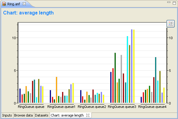
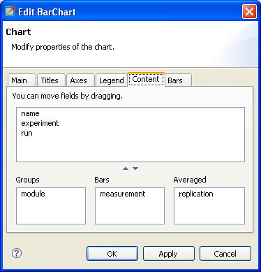
The scalar chart's content can be specified on the Content tab of their Properties dialog. Attributes in the "Groups" list box determine the groups so that within a group each attribute has the same value. Attributes in the "Bars" list box determine the bars; the bar height is the average of scalars that have the same values as the "Bar" attributes. You can classify the attributes by dragging them from the upper list boxes to the lower list boxes. You will normally want to group the scalars by modules and label the bars with the scalar name. This is the default setting, if you leave each attribute in the upper list box.
In addition to the common chart properties, the properties of bar charts include:
Table 10.3. Bar chart properties
| Titles | |
| wrap labels | If true labels are wrapped, otherwise aligned vertically. |
| Plot | |
| bar baseline | Baseline of the bars. |
| bar placement | Arrangement of the bars within a group. |
| Bars | |
| color | Color of the bar. Color name or #RRGGBB. Press Ctrl+Space for a list of color names. |
Line charts can be used to display output vectors. Each vector in the dataset gives a line on the chart. You can specify the symbols drawn at the data points (cross, diamond, dot, plus, square triangle or none), how the points are connected (linear, step-wise, pins or none) and the color of the lines. Individual lines can be hidden.
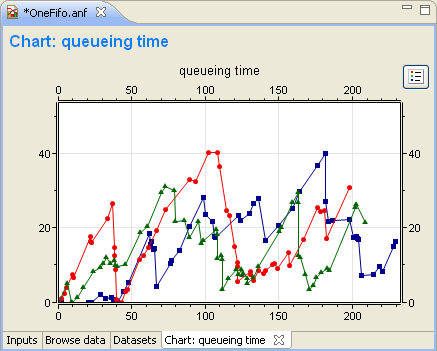
Line names identify lines on the legend, property sheets and edit dialogs. They are formed automatically from attributes of the vector (like file, run, module, vector name, etc.). If you want to name the lines yourself, you can enter a name pattern in the Line names field of the Properties dialog (Main tab). You can use "{file}", "{run}", "{module}", or "{name}" to refer to an attribute value. Press Ctrl+Space for the complete list.
Processing operations can be applied to the dataset of the chart by selecting Apply or Compute from the context menu. If you want to remove an existing operation, you can do it from the context menu, too.
Line charts are synchronized with Output Vector and Dataset views. Select a data point and you will see that the data point and the vector are selected in the Output Vector and Dataset View, as well.
Table 10.4. Line chart properties
| Axes | |
| x axis min | Crops the input below this x value. |
| x axis max | Crops the input above this x value. |
| Lines | |
| display name | Display name of the line. |
| display line | Displays the line. |
| symbol type | The symbol drawn at the data points. |
| symbol size | The size of the symbol drawn at the data points. |
| line type | Line drawing method. One of Linear, Pins, Dots, Points, Sample-Hold or Backward Sample-Hold. |
| line color | Color of the line. Color name or #RRGGBB. Press Ctrl+Space for a list of color names. |
Histogram charts can display data of histograms. They support three view modes:
- Count
The chart shows the recorded counts of data points in each cell.
- Probability density
The chart shows the probability density function computed from the histogram data.
- Cumulative density
The chart shows the cumulative density function computed from the histogram data.
Tip
When drawing several histograms on one chart, set the "Bar type" property to Outline. This way the histograms will not cover each other.
Table 10.5. Histogram chart properties
| Plot | |
| bar type | Histogram drawing method. |
| bar baseline | Baseline of the bars. |
| histogram data type | Histogram data. Counts, probability density and cumulative density can be displayed. |
| show overflow cell | Show over/underflow cells. |
| Histograms | |
| hist color | Color of the bar. Color name or #RRGGBB. Press Ctrl+Space for a list of color names. |
Scatter charts can be created from both scalar and vector data. You have to select one statistic for the x coordinates; other data items give the y coordinates. How the x and y values are paired differs for scalars and vectors.
Scalars. For each value of the x scalar, the y values are selected from scalars in the same run.
Vectors. For each value of the x vector, the y values are selected from the same run and with the same simulation time.
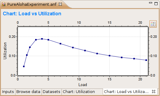
By default, each data point that comes from the same y scalar belongs to the same line. This is not always what you want because these values may have been generated in runs having different parameter settings; therefore, they are not homogenous. You can specify scalars to determine the "iso" lines of the scatter chart. Only those points that have the same values of these "iso" attributes are connected by lines.
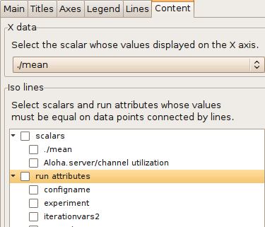
Tip
If you want to use a module parameter as an iso attribute, you can record it as a scalar by setting "<module>.<parameter_name>.param-record-as-scalar=true" in the INI file.
Table 10.6. Scatter chart properties
| Axes | |
| x axis min | Crops the input below this x value. |
| x axis max | Crops the input above this x value. |
| Lines | |
| display name | Display name of the line. |
| display line | Displays the line. |
| symbol type | The symbol drawn at the data points. |
| symbol size | The size of the symbol drawn at the data points. |
| line type | Line drawing method. One of Linear, Pins, Dots, Points, Sample-Hold or Backward Sample-Hold. |
| line color | Color of the line. Color name or #RRGGBB. Press Ctrl+Space for a list of color names. |