This section will guide you through the use of the Sequence Chart and Eventlog Table tools, using example simulations from OMNeT++ and the INET Framework. Before running any of the simulations, make sure that eventlog recording is enabled by adding the line
record-eventlog = true
in the omnetpp.ini file in the simulation's directory. To open the
generated eventlog in the OMNeT++ IDE, go to the example's
results directory in the Resource
Navigator View, and double-click the log file. By default, the file
will open in the Sequence Chart.
Tip
To open the file in the Eventlog Table as editor, right-click the file, and choose the corresponding item from the context menu's Open With submenu.
The Tictoc example is available in the OMNeT++ installation under the directory
samples/tictoc. Tictoc is the most basic example in this
chapter and it provides a quick overview on how to use and understand the Sequence
Chart.
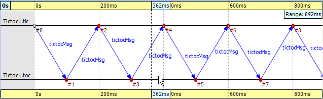
Start the simulation and choose the simplest configuration, 'Tictoc1', which specifies only two nodes called 'tic' and 'toc.' During initialization, one of the nodes will send a message to the other. From then on, every time a node receives the message, it will simply send it back. This process continues until you stop the simulation. In Figure 9.15, “ Tictoc with two nodes ” you can see how this is represented on a Sequence Chart. The two horizontal black lines correspond to the two nodes and are labeled 'tic' and 'toc.' The red circles represent events and the blue arrows represent message sends. It is easy to see that all message sends take 100 milliseconds and that the first sender is the node 'tic.'
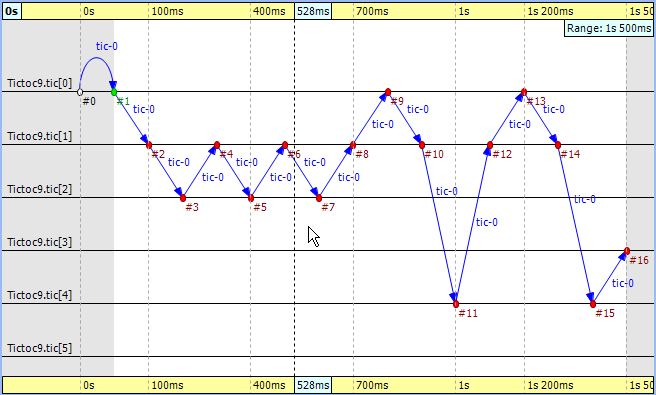
In the next Tictoc example, there are six nodes tossing a message around until it reaches its destination. To generate the eventlog file, restart the simulation and choose the configuration 'Tictoc9'. In Figure 9.16, “ Tictoc with six nodes ” you can see how the message goes from one node to another, starting from node '0' and passing through it twice more, until it finally reaches its destination, node '3.' The chart also shows that this example, unlike the previous one, starts with a self-message instead of immediately sending a message from initialize to another node.
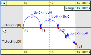
Let us demonstrate with this simple example how filtering works with the Sequence
Chart. Open the Filter Dialog with the toolbar button ![]() and put a checkmark for node '0' and '3' on the Module filter|by
name panel, and apply it. The chart now displays only two axes that
correspond to the two selected nodes. Note that the arrows on this figure are
decorated with zigzags, meaning that they represent a sequence of message
sends. Such arrows will be called virtual message sends in the rest of this
chapter. The first two arrows show the message returning to node '0' at
event #9 and
event #13, and the third
shows that it reaches the destination at
event #16. The
events where the message was in between are filtered out.
and put a checkmark for node '0' and '3' on the Module filter|by
name panel, and apply it. The chart now displays only two axes that
correspond to the two selected nodes. Note that the arrows on this figure are
decorated with zigzags, meaning that they represent a sequence of message
sends. Such arrows will be called virtual message sends in the rest of this
chapter. The first two arrows show the message returning to node '0' at
event #9 and
event #13, and the third
shows that it reaches the destination at
event #16. The
events where the message was in between are filtered out.
The FIFO example is available in the OMNeT++ installation under the directory
samples/fifo. The FIFO is an important example because it
uses a queue, which is an essential part of discrete event simulations and
introduces the notion of message reuses.
When you start the simulation, choose the configuration 'low job arrival rate' and let it run for a while. In Figure 9.18, “ The FIFO example ” you can see three modules: a 'source', a 'queue', and a 'sink.' The simulation starts with a self-message and then the generator sends the first message to the queue at event #1. It is immediately obvious that the message stays in the queue for a certain period of time, between event #2 and event #3.
Tip
When you select one event and hover with the mouse above the other, the Sequence Chart will show the length of this time period in a tooltip.Finally, the message is sent to the 'sink' where it is deleted at event #4.
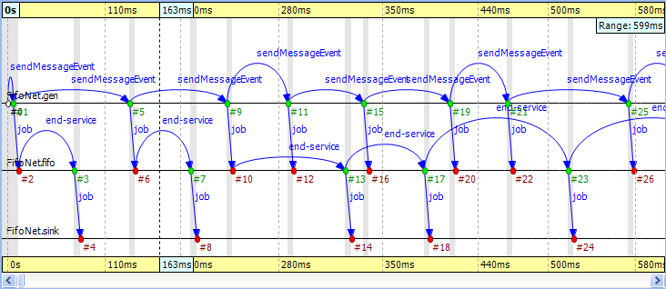
Something interesting happens at event #12 where the incoming message suddenly disappears. It seems like the queue does not send the message out. Actually, what happens is that the queue enqueues the job because it is busy serving the message received at event #10. Since this queue is a FIFO, it will send out the first message at event #13. To see how this happens, turn on Show Reuse Messages from the context menu; the result is shown in Figure 9.19, “ Showing reuse messages ”. It displays a couple of green dotted arrows, one of which starts at event #12 and arrives at event #17. This is a reuse arrow; it means that the message sent out from the queue at event #17 is the same as the one received and enqueued at event #12. Note that the service of this message actually begins at event #13, which is the moment that the queue becomes free after it completes the job received at event #10.
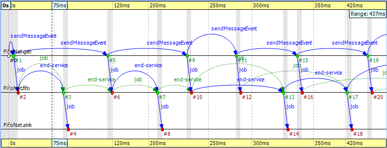
Another type of message reuse is portrayed with the arrow from event #3 to event #6. The arrow shows that the queue reuses the same timer message instead of creating a new one each time.
Note
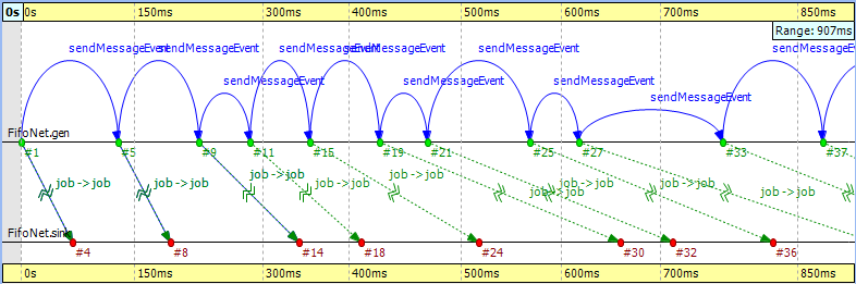
Whenever you see a reuse arrow, it means that the underlying implementation remembers the message between the two events. It might be stored in a pointer variable, a queue, or some other data structure.The last part of this example is about filtering out the queue from the chart. Open the Filter Dialog, select 'sink' and 'source' on the Module filter|by NED type panel, and apply the change in settings. If you look at the result in Figure 9.20, “ Filtering the queue ”, you will see zigzag arrows going from the 'source' to the 'sink.' These arrows show that a message is being sent through the queue from 'source' to 'sink.' The first two arrows do not overlap in simulation time, which means the queue did not have more than one message during that time. The third and fourth arrows do overlap because the fourth job reached the queue while it was busy with the third one. Scrolling forward you can find other places where the queue becomes empty and the arrows do not overlap.
The Routing example is available in the OMNeT++ installation under the directory
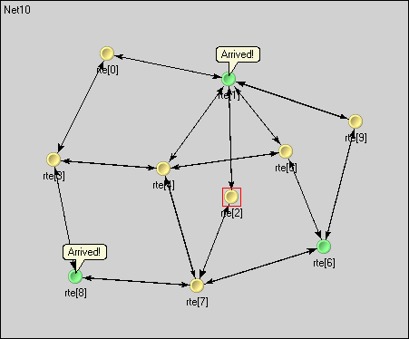
samples/routing. The predefined configuration called 'Net10'
specifies a network with 10 nodes with each node having an application, a few
queues and a routing module inside. Three preselected nodes, namely the node '1,'
'6,' and '8' are destinations, while all nodes are message sources. The routing
module uses the shortest path algorithm to find the route to the destination. The
goal in this example is to create a sequence chart that shows messages which
travel simultaneously from multiple sources to their destinations.
Since we do not care about the details regarding what happens within nodes, we can simply turn on filtering for the NED type 'node.Node.' The chart will have 10 axes with each axis drawn as two parallel solid black lines close to each other. These are the compound modules that represent the nodes in the network. So far events could be directly drawn on the simple module's axis where they occurred, but now they will be drawn on the compound module's axis of their ancestor.
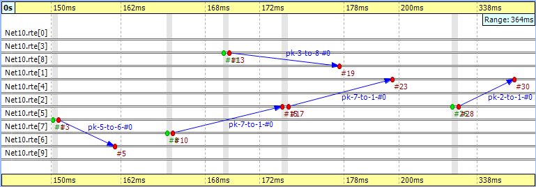
To reduce clutter, the chart will automatically omit events which are internal to a compound module. An event is internal to a compound module if it only processes a message from, and sends out messages to, other modules inside the compound module.
If you look at Figure 9.22, “ Filtering for nodes ” you will see a message going from node '7' at event #10 to node '1' at event #23. This message stays in node '2' between event #15 and event #17. The gray background area between them means that zero simulation time has elapsed (i.e. the model does not account for processing time inside the network nodes).
Note
This model contains both finite propagation delay and transmission time; arrows in the sequence chart correspond to the interval between the start of the transmission and the end of the reception.This example also demonstrates message detail recording configured by
eventlog-message-detail-pattern = Packet:declaredOn(Packet)
in the INI file. The example in Figure 9.23, “ Message detail tooltip ” shows the tooltip presented for the second message send between event #17 and event #23.
It is very easy to find another message on the chart that goes through the network parallel in simulation time. The one sent from node '3' at event #13 to node '8' arriving at event #19 is such a message.
The Wireless example is available in the INET Framework under the directory
examples/adhoc/ieee80211. The predefined configuration called
'Config1' specifies two mobile hosts moving around on the playground and
communicating via the IEEE 802.11 wireless protocol. The network devices are
configured for ad-hoc mode and the transmitter power is set so that hosts can
move out of range. One of the hosts is continuously pinging the other.
In this section, we will explore the protocol's MAC layer, using two sequence charts. The first chart will show a successful ping message being sent through the wireless channel. The second chart will show ping messages getting lost and being continuously re-sent.
We also would like to record some message details during the simulation. To perform
that function, comment out the following line from omnetpp.ini:
eventlog-message-detail-pattern = *:(not declaredOn(cMessage) and not
  declaredOn(cNamedObject) and not declaredOn(cObject))
To generate the eventlog file, start the simulation environment and choose the configuration 'host1 pinging host0.' Run the simulation in fast mode until about event #5000.
When you open the Sequence Chart, it will show a couple of self-messages named 'move' being scheduled regularly. These are self-messages that control the movement of the hosts on the playground. There is an axis labeled 'pingApp,' which starts with a 'sendPing' message that is processed in an event far away on the chart. This is indicated by a split arrow.
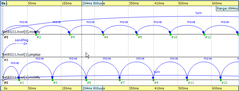
You might notice that there are only three axes in Figure 9.24, “ The beginning ” even though the simulation model clearly contains more simple modules. This is because the Sequence Chart displays the first few events by default and in this scenario, they all happen to be within those modules. If you scroll forward or zoom out, new axes will be added automatically as needed.
For this example, ignore the 'move' messages and focus on the MAC layer instead. To begin with, open the Filter Dialog, select 'Ieee80211Mac' and 'Ieee80211Radio' on the Module filter|by NED type panel, and apply the selected changes. The chart will have four axes, two for the MAC and two for the radio simple modules.
The next step is to attach vector data to these axes. Open the context menu for each axis by clicking on them one by one and select the Attach Vector to Axis submenu. Accept the vector file offered by default. Then, choose the vector 'mac:State' for the MAC modules and 'mac:RadioState' for the radio modules. You will have to edit the filter in the vector selection dialog (i.e. delete the last segment) for the radio modules because at the moment the radio state is recorded by the MAC module, so the default filter will not be right. When this step is completed, the chart should display four thick colored bars as module axes. The colors and labels on the bars specify the state of the corresponding state machine at the given simulation time.
To aid comprehension, you might want to manually reorder the axis, so
that the radio modules are put next to each other. Use the button ![]() on the toolbar to switch to manual ordering. With a
little zooming and scrolling, you should be able to fit the first message
exchange between the two hosts into the window.
on the toolbar to switch to manual ordering. With a
little zooming and scrolling, you should be able to fit the first message
exchange between the two hosts into the window.
The first message sent by 'host1' is not a ping request but an ARP request. The processing of this message in 'host0' generates the corresponding ARP reply. This is shown by the zigzag arrow between event #85 and event #90. The reply goes back to 'host1,' which then sends a WLAN acknowledge in return. In this process, 'host1' discovers the MAC address of 'host0' based on its IP address.
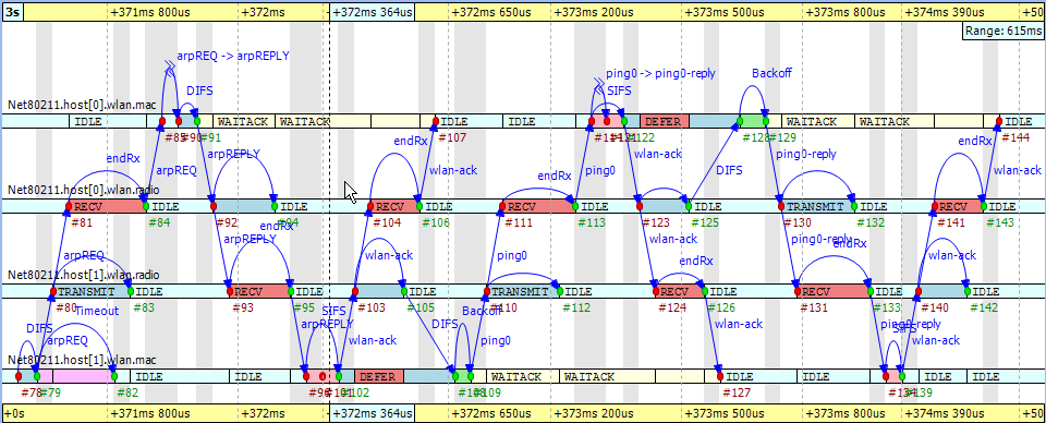
The send procedure for the first ping message starts at event #105 in 'host1' and finishes by receiving the acknowledge at event #127. The ping reply send procedure starts at event #125 in 'host0' and finishes by receiving the WLAN acknowledge at event #144. If you scroll forward, you can see as in Figure 9.26, “ The second ping procedure ” the second complete successful ping procedure between event #170 and event #206. To focus on the second successful ping message exchange, open the Filter Dialog and enter these numbers in the range filter.
Timing is critical in a protocol implementation, so we will take a look at it using the Sequence Chart. The first self message represents the fact that the MAC module listens to the radio for a DIFS period before sending the message out. The message send from event #171 to event #172 occurs in zero simulation time as indicated by the gray background. It represents the moment when the MAC module decides to send the ping request down to its radio module. The back-off procedure was skipped for this message because there was no transmission during the DIFS period. If you look at event #172 and event #173, you will see how the message propagates through the air from 'radio1' to 'radio0.' This finite amount of time is calculated from the physical distance of the two modules and the speed of light. In addition, by looking at event #172 and event #174, you will notice that the transmission time is not zero. This time interval is calculated from the message's length and the radio module's bitrate.
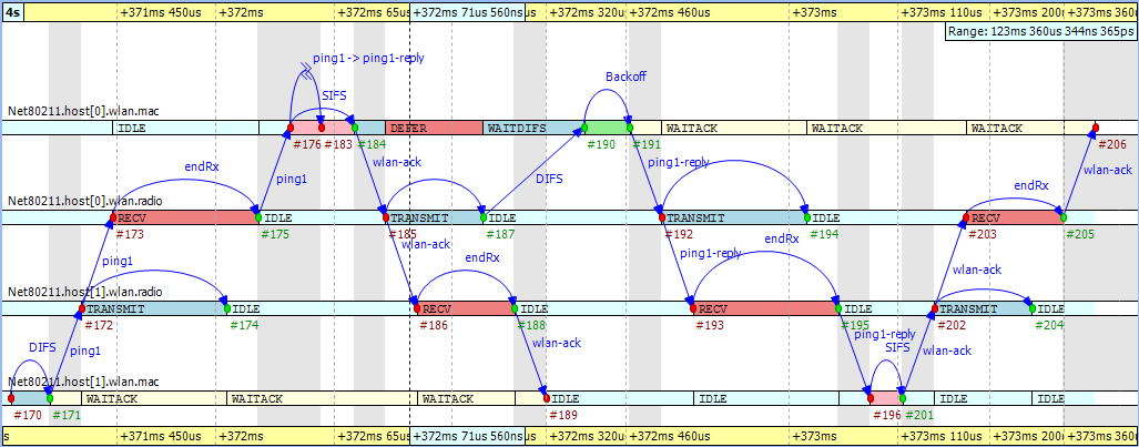
Another interesting fact seen in the figure is that the higher level protocol layers do not add delay for generating the ping reply message in 'host0' between event #176 and event #183. The MAC layer procedure ends with sending back a WLAN acknowledge after waiting a SIFS period.
Finally, you can get a quick overview of the relative timings of the IEEE
802.11 protocol by switching to linear timeline mode. Use the button ![]() on the toolbar and notice how the figure changes
dramatically. You might need to scroll and zoom in or out to see the
details. This shows the usefulness of the nonlinear timeline mode.
on the toolbar and notice how the figure changes
dramatically. You might need to scroll and zoom in or out to see the
details. This shows the usefulness of the nonlinear timeline mode.
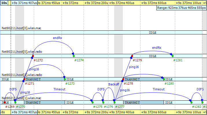
To see how the chart looks when the ping messages get lost in the air, first turn off range filtering. Then, go to event #1269 by selecting the Goto Event option from the Eventlog Table View's context menu. In Figure 9.27, “ Ping messages get lost ” you can see how the receiver radio does not send up the incoming message to its MAC layer due to the signal level being too low. This actually happens at event #1274 in 'host0.' Shortly thereafter, the transmitter MAC layer in 'host1' receives the timeout message at event #1275, and starts the backoff procedure before resending the very same ping message. This process goes on with statistically increasing backoff time intervals until event #1317. Finally, the maximum number of retries is reached and the message is dropped.
The chart also shows that during the unsuccessful ping period, there are no events occurring in the MAC layer of 'host0' and it is continuously in 'IDLE' state.